

It has already been a while, since Microsoft initially announced Fluent UI design for model-driven apps. Once it was generally available, users were able to see the “New look” toggle in the app header.
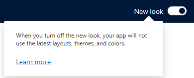
It wasn’t until the Release Wave 1 / 2024, or monthly channel update April 2024, when it became gradually enabled by default for the end users. If you have ever done any branding changes to the look and feel of your model-driven apps, it is probably at this point the latest, when you might’ve noticed that your organization branding suddenly stopped to work.
Reason for this is really simple: If you turn on the new look, it is no longer respecting the legacy themes of D365. This is by design.
But there is a solution for this, and it’s called “modern themes” 😀 These modern theme settings apply to your model-driven apps, when you have that New Look -toggle enabled.
Configuring modern themes
Let’s first take a look what attributes you actually can modify. Unfortunately, with modern themes you can only affect app header colors! Although it usually is enough, and I do understand that Microsoft probably wants the apps to have a little bit more unified look and feel. Maybe, just maybe they will later add more attributes… but currently we just have to cope with what is provided.
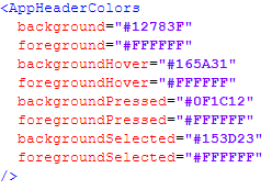
Currently supported attributes by Microsoft are the following:
Background– The background color of the app header. This element must be defined for any changes to take effect.Foreground– The text color of the app header. If this isn’t specified, the system attempts to calculate an appropriate color that has sufficient contrast to the provided background color.BackgroundHover– The background color of buttons on the app header when they’re hovered over. If no value is specified, the system calculates a color based on the background color.ForegroundHover– The text color of buttons on the app header when they’re hovered over. If no value is specified, the system attempts to calculate an appropriate color that has sufficient contrast to the backgroundHover color.BackgroundPressed– The background color of buttons on the app header when they’re pressed. The defaulting logic is the same as backgroundHover.ForegroundPressed– The text color of buttons on the app header when they’re pressed. The defaulting logic is the same as foregroundHover.BackgroundSelected– The background color of buttons on the app header when they’re selected. The defaulting logic is the same as backgroundHover.ForegroundSelected– The text color of buttons on the app header when they’re selected. The defaulting logic is the same as backgroundHover.
Also in the examples, there is a good template that we can use for creating our own branding through modern themes. As you can see, the colors are defined in hex color codes.
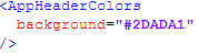
Let’s do very simple one, and just change the app header background color, which is also probably the most requested branding alongside the logo (which we will go through shortly).
First you need to choose the color you want for your background. If you don’t remember any the hex codes on top of your head, you can pick from the various color picker tools, or just use the Google’s plain and simple color picker. Most of the companies want to utilize their brand colors, so you can (and should) also ask your marketing department if they have any preferences. PS. They most likely remember the brand hex codes from top of their head😜
You don’t have to specify all the attributes in the XML, if you don’t to change them. For example, I changed only the background. I suggest experimenting with what works the best. The platform knows how to do some changes if the current font color (white) doesn’t work well with the provided background color, but that will only get you so far. So add more attributes as you choose and pick what works the best for your branding.
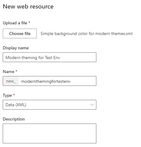
Save the XML definitions into a file, and go to the maker portal. Select an existing solution or create a new solution, depending on your solution strategy, and add the newly created XML-file into that solution as a web resource with an appropriate name.
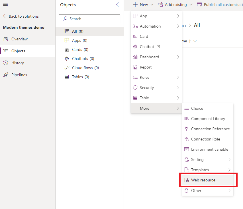
Next we need to add the override setting into the same solution
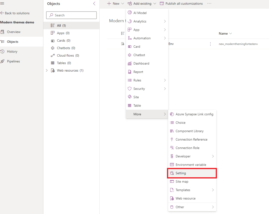
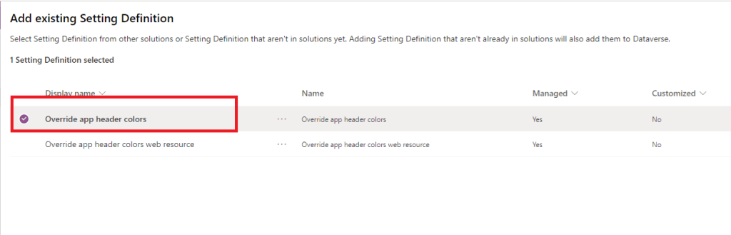
Search for “Override app header colors”, you will probably get two results. Add the one with exact name “Override app header colors”.
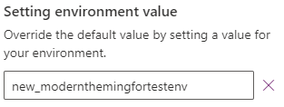
After adding the setting to the solution, open the setting for editing by clicking on it. Add the name of the web resource you previously created, to the environment value -field.
After this, remember to publish the customizations, and go to validate that the app header colors are correctly applied.
Looks good!
What about the logo?
At the moment of writing, I am not aware of adding the logo being supported by modern themes 😦 Might be that the support for that is added later down the road. Luckily, there is a workaround, and it’s in the classic themes! It seems to be so, that the new look & feel doesn’t actually ignore everything in the classic themes, and you can still add and use the logo you want.
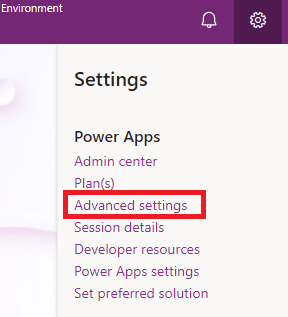
Start configuring the logo by going to the advanced settings. You can access advanced settings either from the maker portal, or through the environment itself if you have it opened. Under the gear icon, select “Advanced settings”
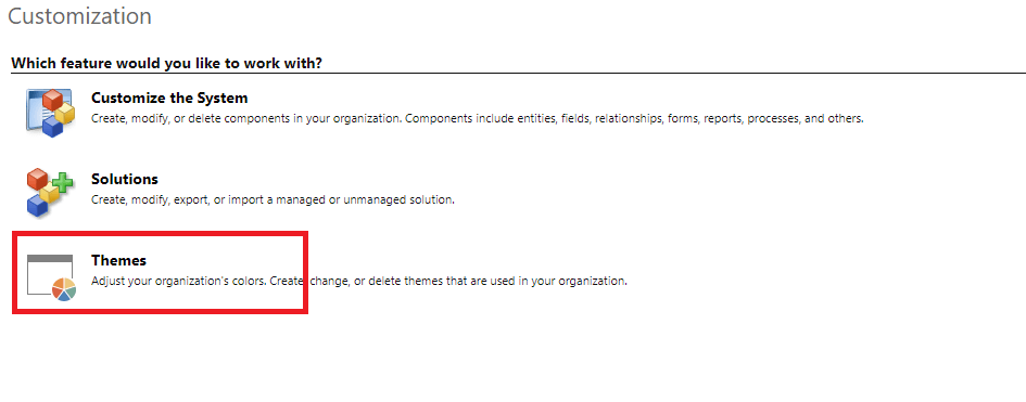
There go to Customizations, and select Themes
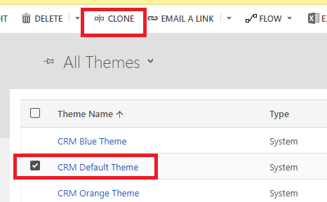
You can start creating completely new theme, or configure existing if you like, but personally I prefer to clone the default theme and start working on that.
Then click on the Logo -field and select New, unless you already have your logo existing as a web resource. In that case, just select it from the lookup. NOTE: Pay attention to the height of the logo! I used 49×48 pixels for this demonstration. If your logo is too big, it won’t fit into the header.
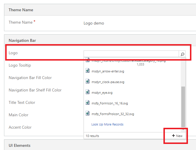
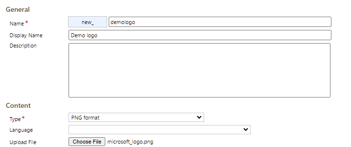
After creating the web resource, just select the newly created logo in the lookup. Then save and select Publish Theme from the navigation bar.

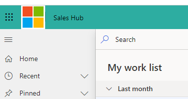
You will already notice that the logo should’ve taken effect, as Advanced Settings are still using the classic theming and there is no way to change that.
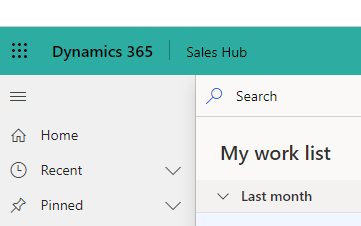
Now all you need to do is to go to your model-driven app, for example Sales Hub, and validate that the logo is present, and your app header colors are taking effect when you have the New Look enabled.
That’s it! Happy configuring! 🤩
 Dynamics Infinite - Blog by Tuomas Anto